Turkish Vaccination Data
This is a little project I did to learn a bit of data science and Juptyer notebooks. It takes a CSV file of vaccination data from the Turkish government and outputs a few graphs. The data is from Kaggle The data came in the format of an SQL database backup with +3 million rows, so I had to restore it, get numbers from, then convert those numbers to a CSV file (download)
I did this by using the Pandas library in python, which required the file to be imported
as a DataFrame data = pd.read_csv(path), then I calculated the total doses,
percentages and other data by using commands like
data["diffOfDose"] = data["1DOSE"] - data["2DOSE"]
Then I plotted the data in a Juptyer notebook, using the plotly library, which, after some headaches with
other
libraries, I found to be the best.
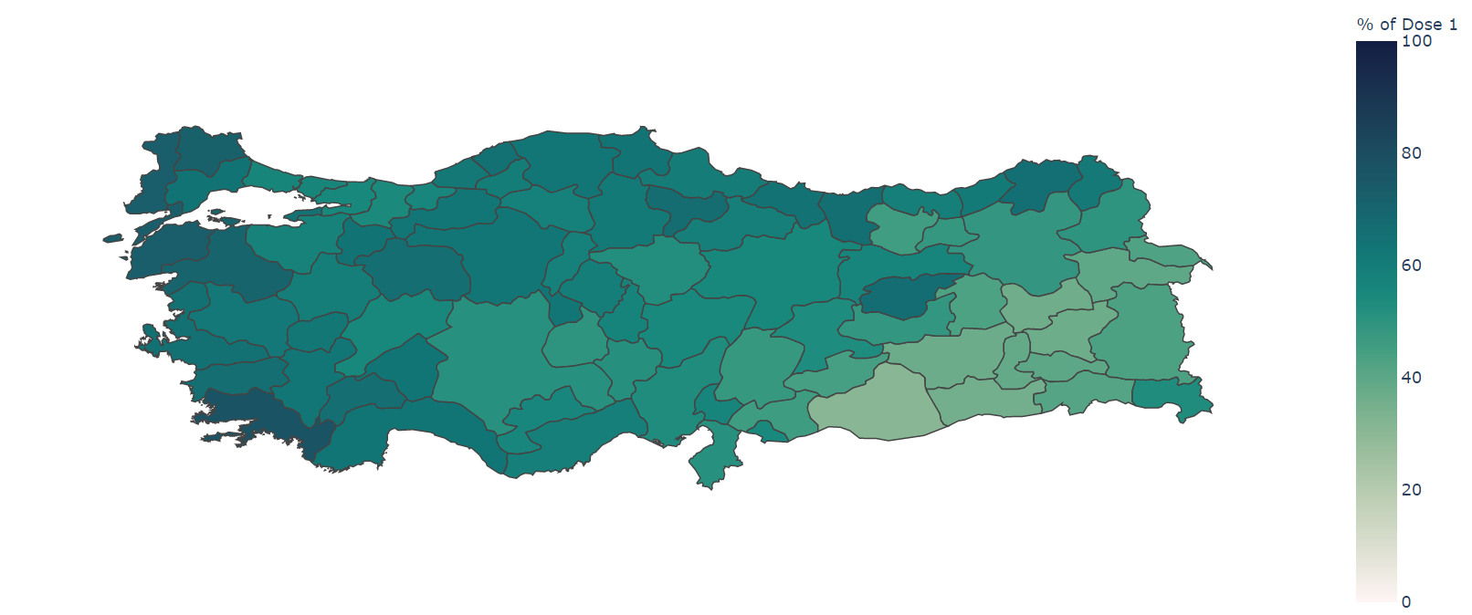
I wanted to create a chotopleth map of the percentages for each county, which required the geojson data of
turkey.
After some searching, I found the data in this GitHub
repo.
The code I use for generating the map is:
              def makeMap(value, colorrange, labelName):
                geojsonlink = "https://raw.githubusercontent.com/alpers/Turkey-Maps-GeoJSON/master/tr-cities.json"

                with urlopen(geojsonlink) as response:
                  cities = json.load(response)

                  fig = px.choropleth(data,
                                      geojson=cities,
                                      color=value,
                                      locations="CITY",
                                      featureidkey="properties.name",
                                      range_color=colorrange,
                                      labels={"CITY" :"City", value: labelName},
                                      color_continuous_scale="tempo") #matter algae
                  fig.update_layout(margin={"r":0,"t":0,"l":0,"b":0})
                  fig.update_geos(fitbounds="locations", visible=False)
                  fig.show()
This code generates the map you see in the title. I also made a grouped bar chart of the doses. The graph below shows the first dose of the top 5 cities. I was going to make it top 5, then a nice seperator, then bottom 5 for the percentages in one chart, but that proved too difficult, so I instead made 2 charts:
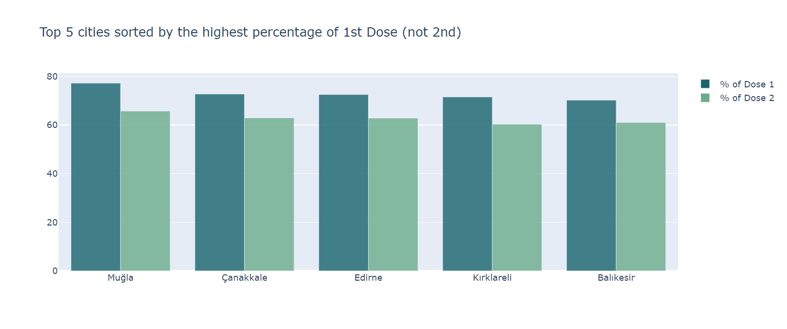
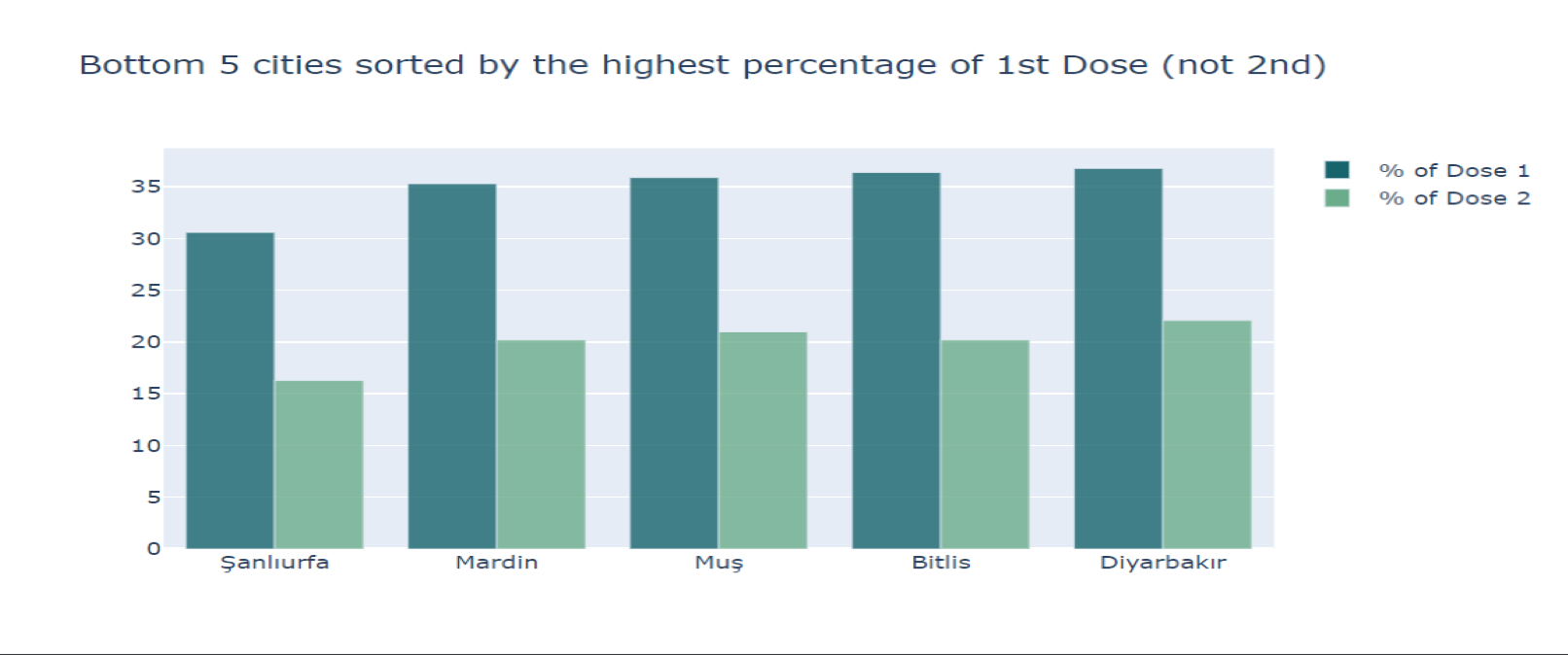
The graphs are also generated using the plotly library, with the following code:
                def top5Bar(mainNum, otherNum, colours):
                  name1 = "percOfDose" + str(mainNum)
                  name2 = "percOfDose" + str(otherNum)

                  mainDose = data.nlargest(5, name1)[["CITY", name1]]
                  otherDose = data.loc[data['CITY'].isin(mainDose["CITY"])].copy()

                  mainDose[name1] = mainDose[name1].round(decimals=1)
                  otherDose[name2] = otherDose[name2].round(decimals=1)

                  fig = go.Figure(data=[
                      go.Bar(name="% of Dose " + str(mainNum), x = mainDose["CITY"],y=mainDose[name1],
                            marker=dict(color=colours[0],opacity=0.8)),
                      go.Bar(name="% of Dose " + str(otherNum), x = otherDose["CITY"],y=otherDose[name2],
                            marker=dict(color=colours[1],opacity=0.8))
                  ])
                  fig.update_layout(barmode="group", title_text="Top 5 cities sorted by the highest percentage of "+
                                                                str(mainNum) + findSuffix(mainNum) + " Dose (not " +
                                                                str(otherNum) + findSuffix(otherNum) + ")")
                  fig.show()